
AI-Powered Homepage
Overview
The edX homepage had become crowded with banners, categories, and competing entry points. While effective for users who arrived with a clear course in mind, it often left new and exploratory learners overwhelmed. I led the redesign effort to simplify discovery, reduce cognitive load, and create a more modern, personalized entry experience.
Role

Lead UX designer
and researcher
Timeline

6 weeks
(3 sprints)
Team

Product manager,
engineers
Activities

AI benchmarking, interviews, personas, design
Focus

Simple entry points, scalable, personalization
Problems
New users reported feeling overwhelmed by too many entry points (categories, banners, and featured courses competing for attention).
Course discovery was primarily search-based, which worked for users who already knew what they wanted, but not for exploratory learners.
The static homepage experience didn’t reflect the intuitive, personalized guidance today’s learners expect.
How Might We…
How might we simplify the homepage experience to reduce overwhelm and guide learners toward a clear starting point?
How might we support exploratory learners by making course discovery feel guided and intuitive, rather than purely search-based?
How might we deliver personalized, conversational recommendations that adapt to each learner’s goals and expectations?
Research
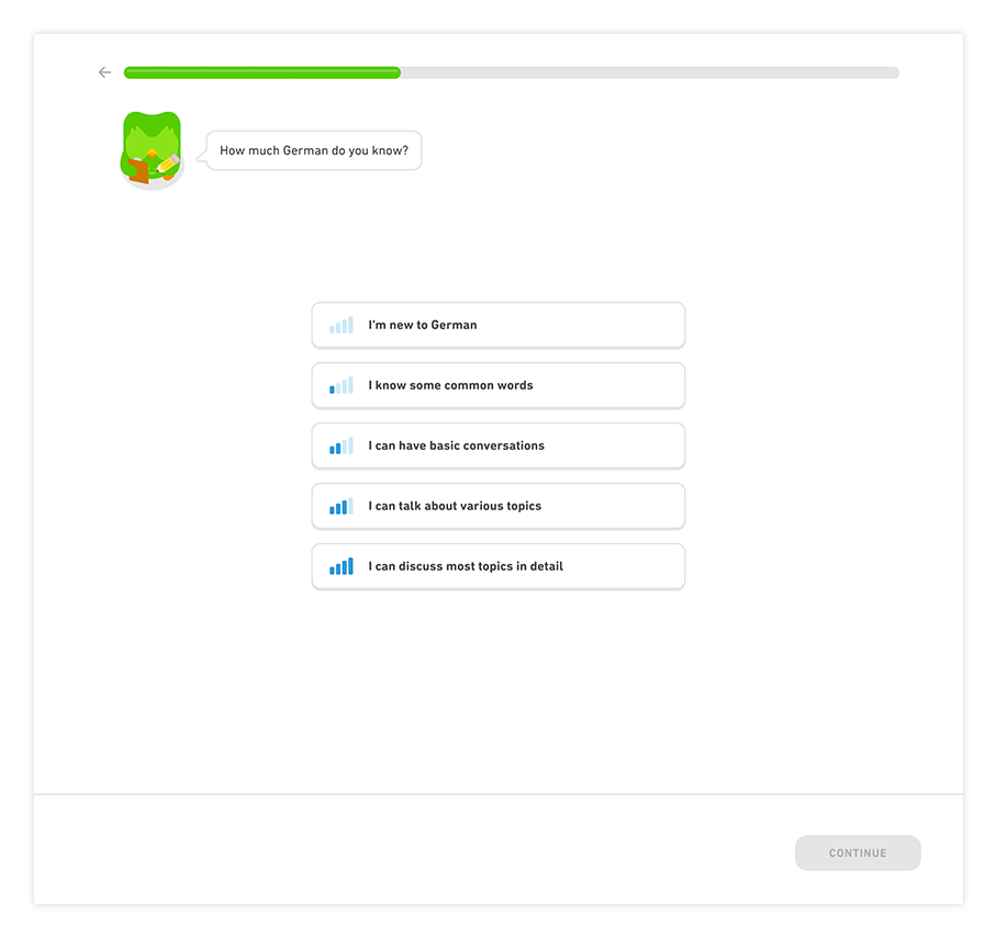
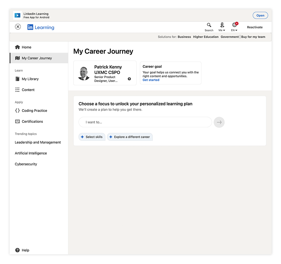
Benchmarking against conversational and AI-driven platforms
Benchmarked against conversational platforms like Coursera, ChatGPT, Duolingo, Linkedin and Spotify.
Insight: learners prefer guided discovery to browsing long catalogs.
7 User interviews
I conducted seven 30–45 minute interviews with learners from diverse backgrounds, combining open-ended questions and light usability walkthroughs of the current edX homepage. This approach surfaced both immediate frustrations (too many competing entry points) and deeper needs, such as clearer guidance and personalized recommendations.

Personas and findings
User interviews revealed three consistent problems:
New users felt overwhelmed by too many entry points.
Course discovery relied heavily on search, which worked for directed learners but not exploratory ones.
The homepage felt static and outdated compared to the intuitive, personalized experiences learners expect today.


Design Approach
Conversational first – Invite learners to describe their goals in natural language.
Guided exploration – Provide quick suggestion chips for common pathways.
Personalized recommendations – Use goals and history to surface relevant learning paths.
Minimal & modern – Reduce clutter, emphasize white space, and build trust with subtle institutional anchors.
Designs
Existing experience
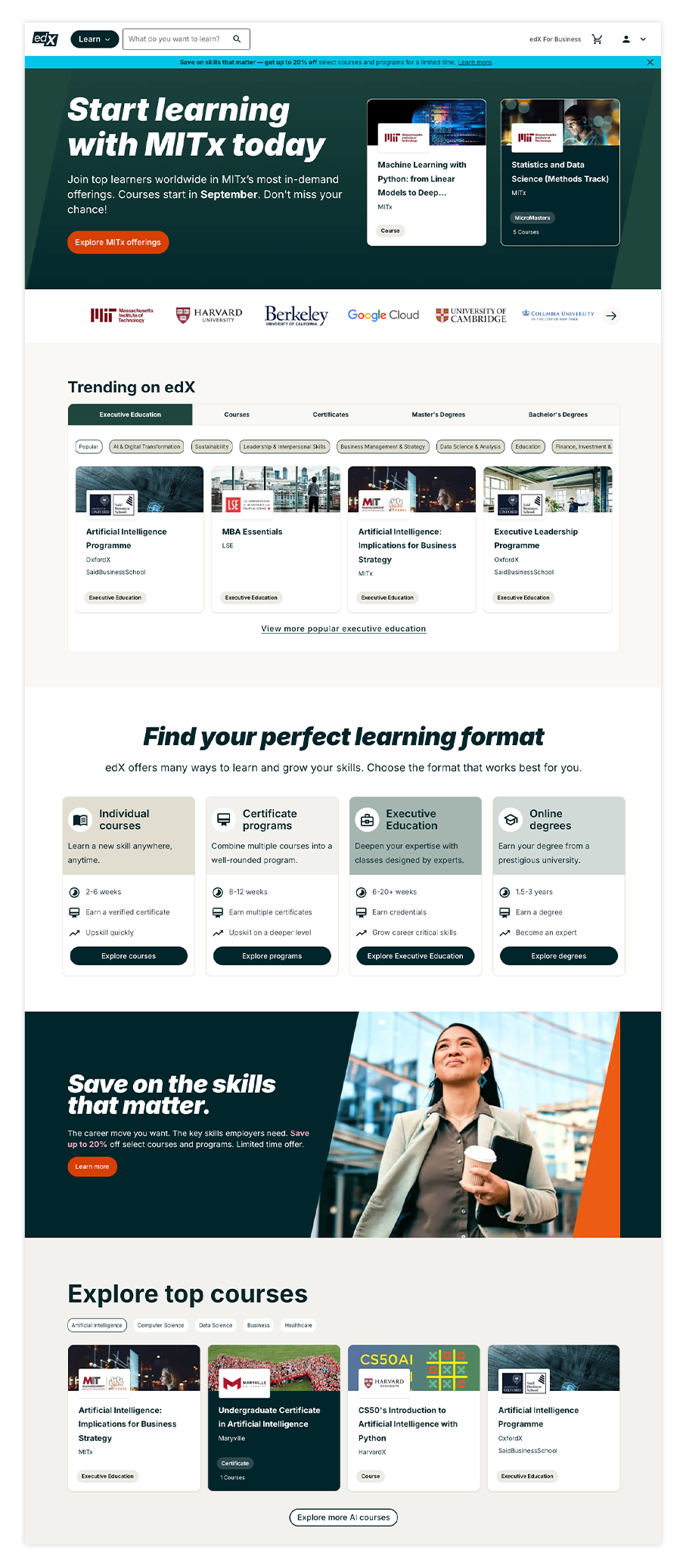
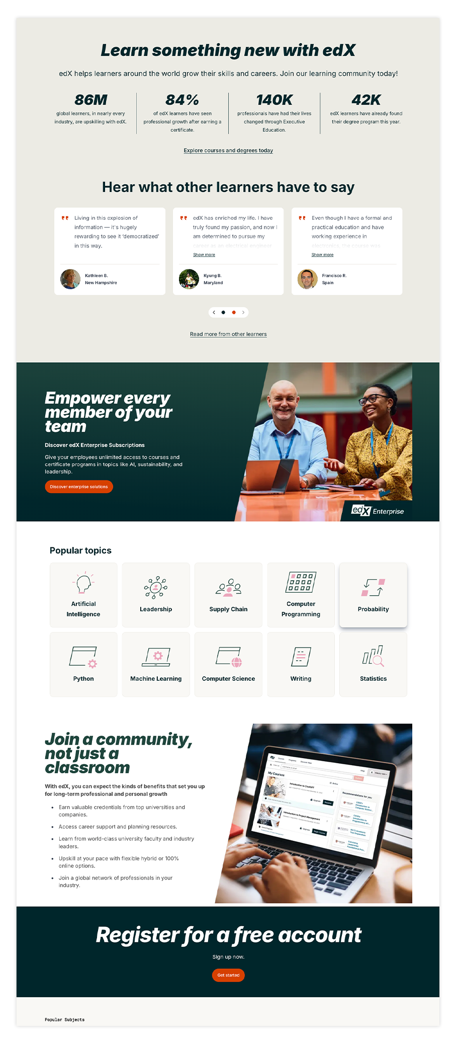
Cluttered homepage – overlapping banners, stacked categories, and featured courses competing for attention.
Excessive entry points – multiple CTAs (categories, subjects, search, promotions) pulling users in different directions.
Information overload – too many visual elements on a single screen without hierarchy.
Lack of focus – no clear starting point for new or exploratory learners.
Overlapping promotional messaging – several banners stacked, each vying for attention.
Static design – imagery that feels flat, with no sense of personalization or guidance.
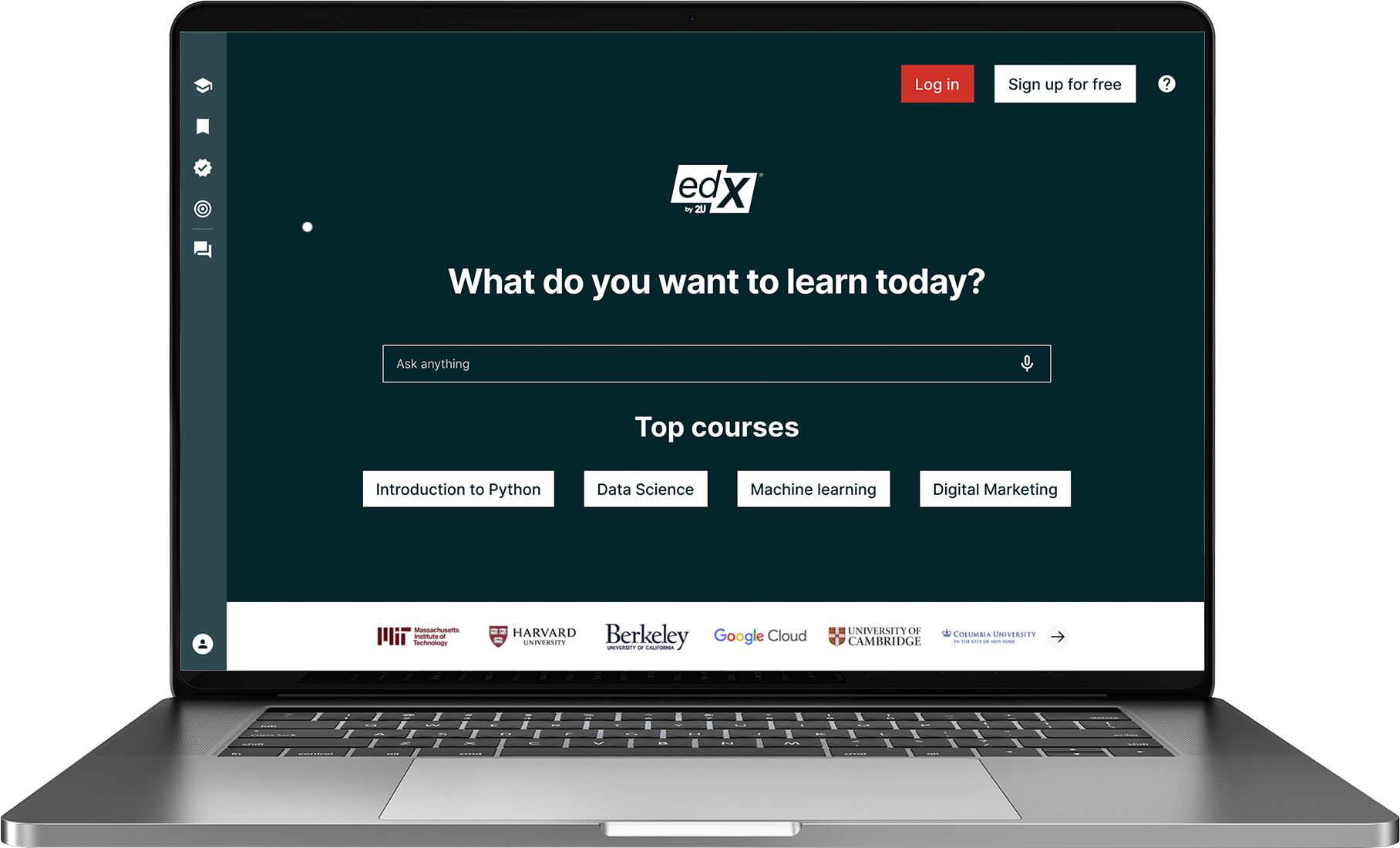
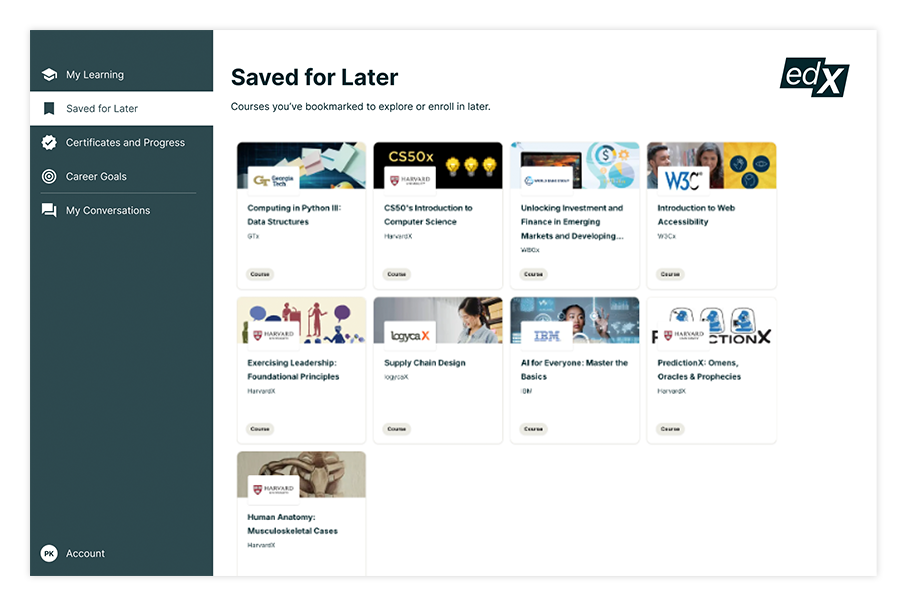
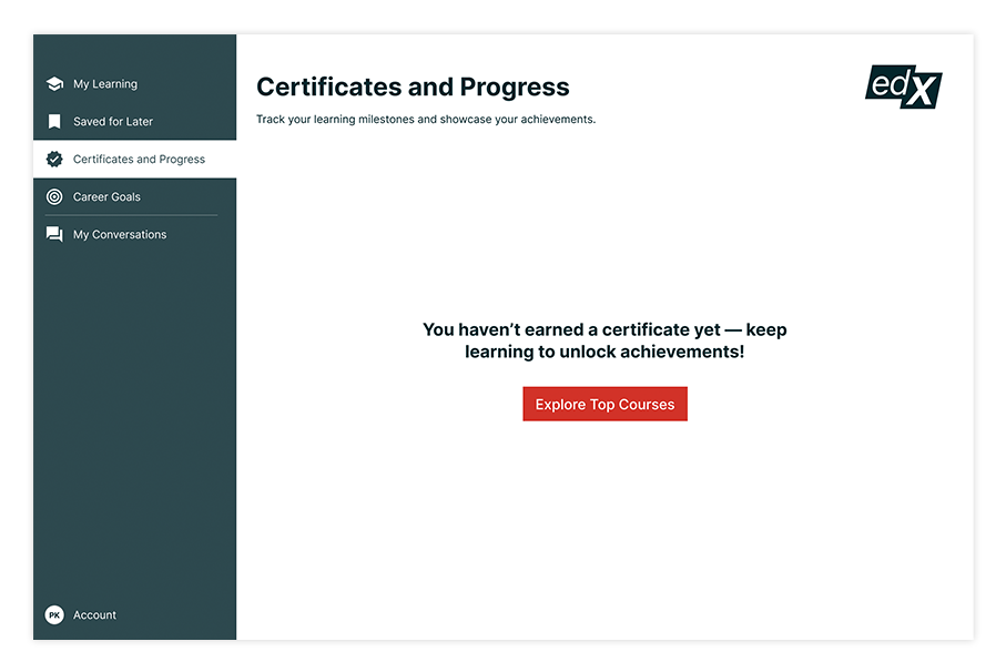
Proposed experience
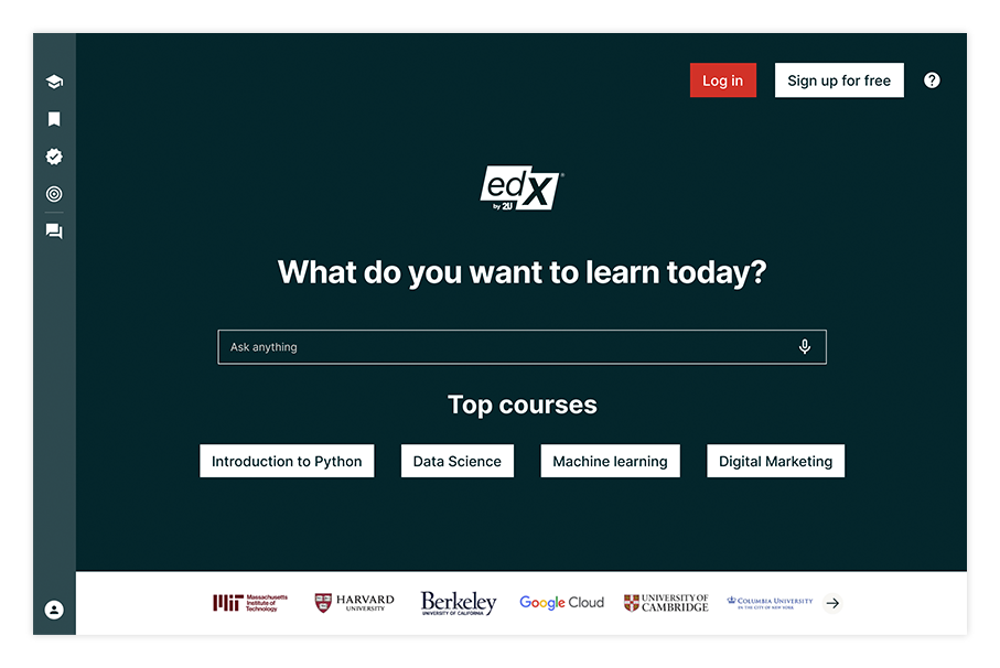
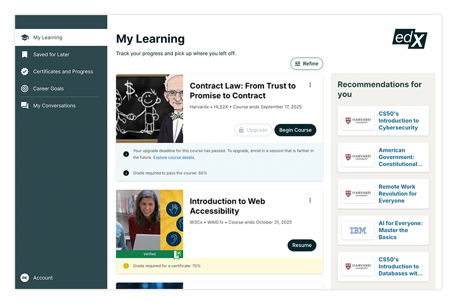

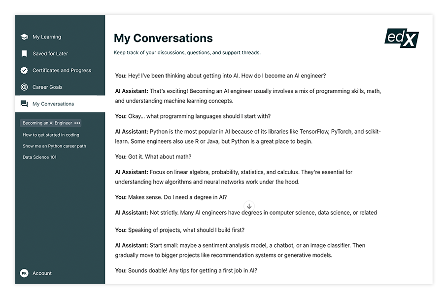
Single clear entry point – conversational prompt (“What do you want to learn today?”) that guides users forward.
Guided exploration – quick suggestion chips for common pathways (e.g., Career Skills, Certificates, Degrees).
Personalized recommendations – relevant courses and learning paths surfaced based on goals and history.
Consistent navigation – left-side rail for orientation across categories and pathways.
Reduced cognitive load – fewer competing banners and CTAs, more whitespace and hierarchy.
Modern interaction model – adaptive, conversational flow inspired by ChatGPT.
Institutional credibility – partnered universities and organizations featured prominently to build trust and authority.
Next Steps
Personalization roadmap – expand recommendations to dynamically adapt based on user behavior and goals.
AI-driven guidance – explore chat-based course advisors that simulate human coaching.
Deeper integration with institutions – highlight credibility by surfacing relevant partners within pathways.
A/B testing & metrics tracking – measure reduced bounce rate, improved course discovery, and enrollment conversion.
Mobile optimization – refine the conversational experience for smaller screens.
Scalable design system – roll out conversational and guided exploration patterns across other edX touchpoints (catalog, dashboards).