
Bootcamp Paid Landing Pages
Overview
Prospective learners visiting bootcamp landing pages weren’t finding enough detail to make decisions, and lead forms were poorly placed. I redesigned the pages to improve content hierarchy, highlight value propositions like pricing and testimonials, and make lead generation more accessible, resulting in stronger conversion potential.
Role

Lead UX designer
and researcher
Timeline

2 weeks
(1 sprint)
Team

UX, product manager,
engineers
Activities

Interviews, heat-maps, design
Focus

Value communication, hierarchy, conversion
Problems
Potential learners do not have all the necessary information they need on our current lead generation pages to move forward.
Potential learners have a difficult time navigating the most important information on lead generation pages.
Potential learners do not have a the lead generation form visible to them during the their vetting process.
How Might We…
How might we provide a clear understanding of the value of this product offer that gives them the confidence to pursue more information?
How might we give the user an easy way to navigate the hierarchy of information so that they are comfortably informed?
How might we make it easier to find and fill out the lead generation form when the user is on the lead generation page?
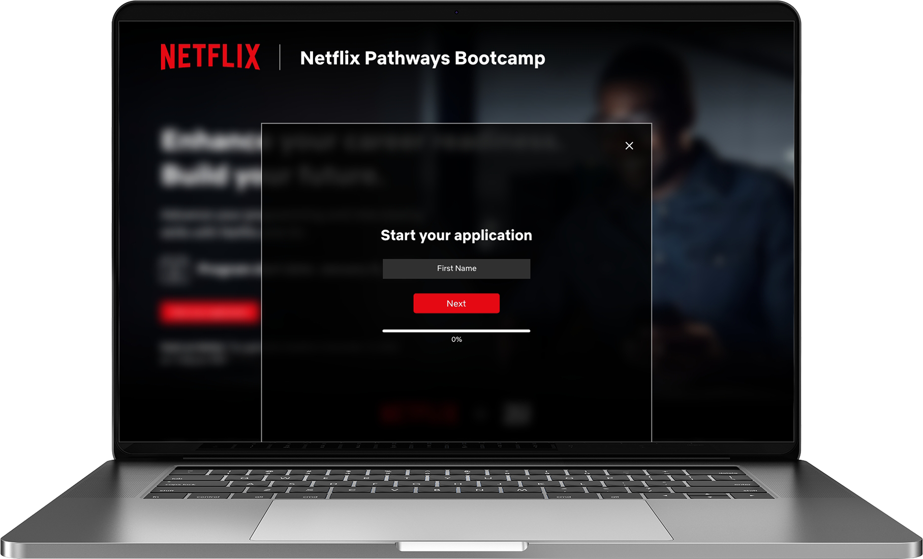
MVP spoiler alert: Modal form
But please read following sections to see my process on how we came to these decisions.
Research
7 User interviews
I conducted user interviews using usertesting.com. Each interview was about 45 minutes long that focused on content discovery, value props and form design.


CrazyEgg insights
I used CrazyEgg for quantitative insights, focusing on heatmaps, scroll map and confetti maps for click and engagement behavior.

Research Results
User interviews
Observations:
4 users were not sure what they were getting, and were hesitant
to fill out the form5 users were not sure where the form was when they wanted to fill it out
6 users wanted more detail about the curriculum
All users wanted to know how much it would cost and if they were any payments options
4 users wanted to know if there was any career services after the bootcamp was completed
Crazyegg
Observations:
Users stayed above the fold and missed important information as indicated by the heat and scroll map
Several areas on the page were identified as thought to be clickable, as identified by return users and rage-clicking
Lead generation form was only available at top of the page which may lead to users not seeing all information or becoming frustrated with no clear interaction point below the fold
Design Approach
Learner-focused content – Structure pages around curriculum, cost, and outcomes.
Persistent enrollment – Keep the signup form visible to capture intent throughout the page.
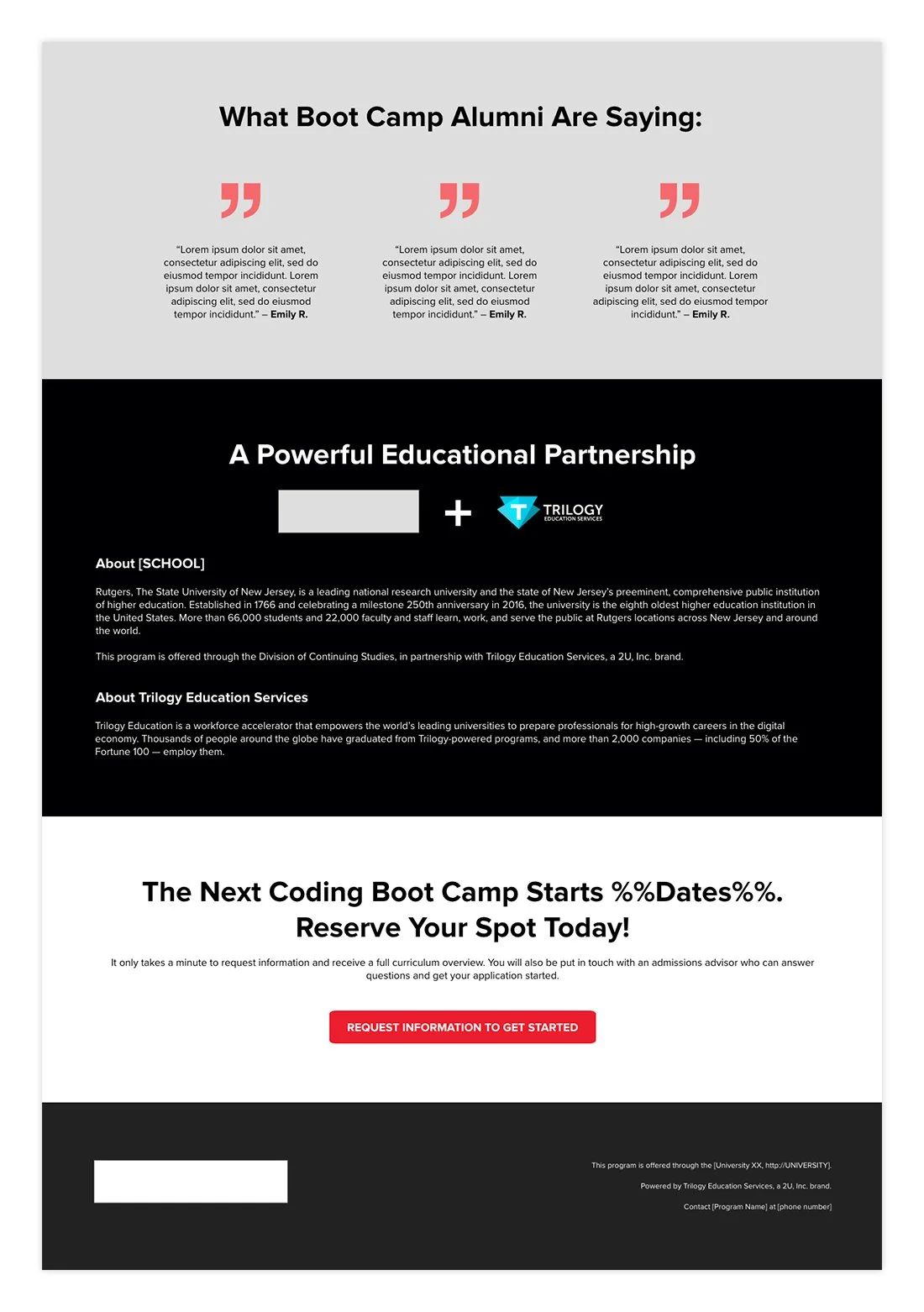
Built-in trust – Include testimonials, partner logos, and flexible payment options.
Scannable layout – Design pages that are easy to read across devices and program types.
Design Recommendations
Add pricing information and flexible payment options information (this was A/B tested)
Add employer partner logos and testimonials
Add additional modal form for down-page access
Add clear value props to hero section
Add important information around dates, time spent and completion expectations
Include curriculum information detail
Example shown here of wireframes that are modular and scalable across 7 different Bootcamp programs.


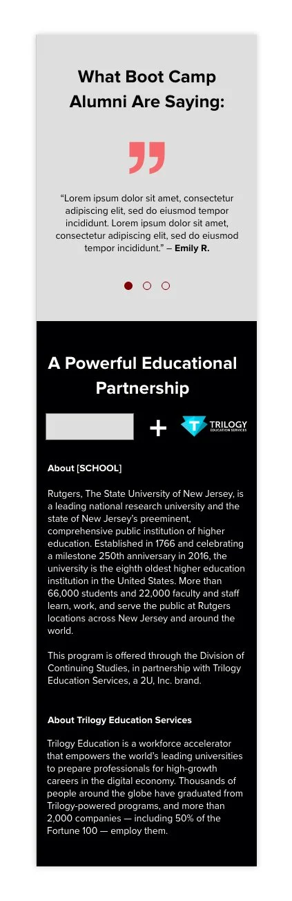


Prototype for desktop and mobile
Next Steps
A/B test new content and layout iterations for improved conversion
Continue monitoring quantitative data around clicks and heat maps
Continue monitoring which marketing channel click-throughs are most successful
Constant feedback
Develop feedback widgets for new features and experience